Finance
Product Redesign Drove Over 85% Migration and a Company Acquisition
Our customers were accountants and financial managers dealing with complex financial data every day. The software needed to handle heavy tax and reporting work, but still feel clear and easy to use.
What started as one main software gradually grew into a suite of connected modules - tax software, CRM, management tools, and more.
My goal was to turn an overloaded system into a smooth tool that saves time and builds trust.
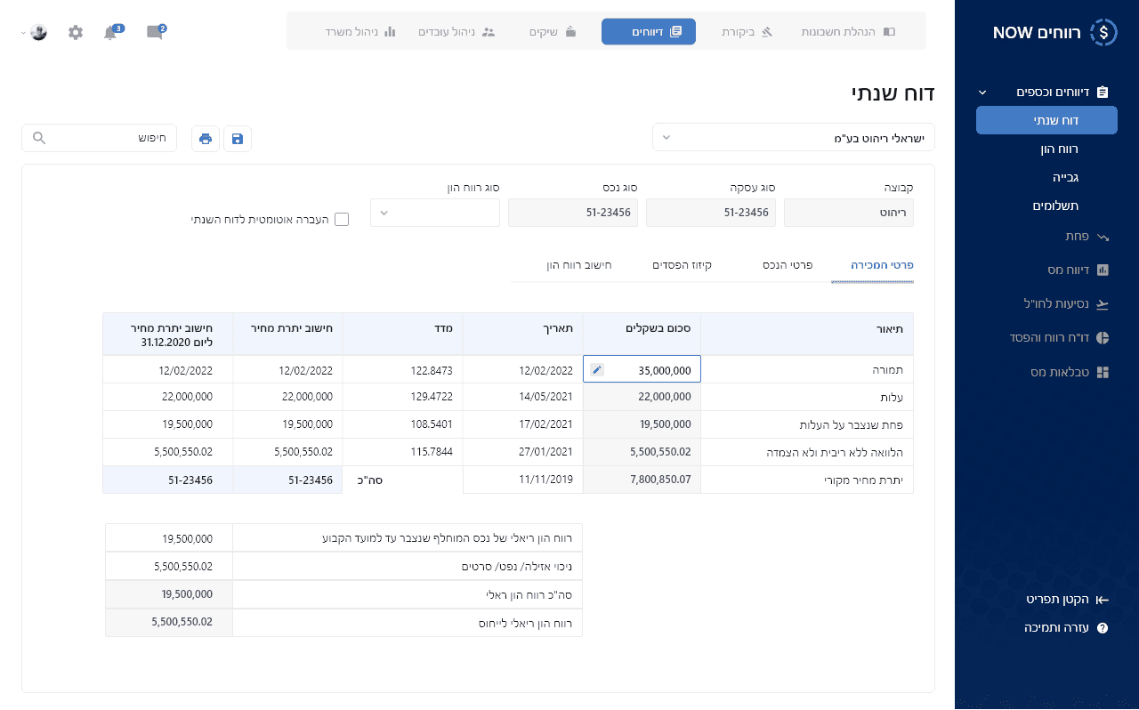
Final design– tax reporting interface
When Growth Creates Friction
Every new module added more screens and features, making the interface heavy and crowded.
We received many customer complaints that the screens were not intuitive, and some clients even moved to competitors.
This raised a key question:
How can we keep a system valuable and feature-rich, while still making it simple and easy to use?
Uncovering Core Pain Points
It was important for me to deeply understand who our users are, what they truly need, and how to bridge the gap between what they want and what the system provides.
I interviewed users, ran usability tests at client offices, read satisfaction surveys, and worked closely with the Customer Success Manager to identify pain points and improve the experience.
Key findings:
Many users used only a small part of the system’s features.
Screens were cluttered and hard to read.
Important actions were hard to find
The flow between screens felt inconsistent and confusing.

One of the tested research questions
A Systematic Approach to Design
Whether I was redesigning a single screen, adding a new feature, or rebuilding an entire module, my process stayed the same.
My Process:
Mapped real usage scenarios and user journeys.
Defined clear content hierarchy and grouped information by context.
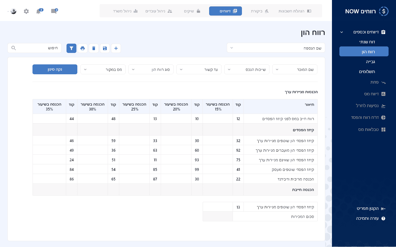
Designed clean UI components: tables, charts, forms - all matching one visual language.
Checked ideas with developers and the product manager to ensure feasibility.
Conducted customer interviews and usability testing to validate ease of use.
Testing & Refining: Iterative Improvements
Here’s an example of how this played out in practice:
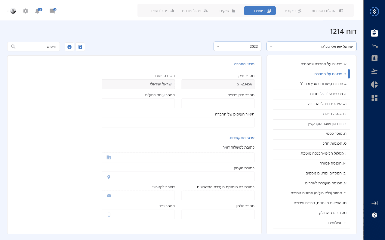
The old horizontal menu caused users to miss key options. I redesigned it as a vertical side menu with two states: fully open and collapsed, to save space while keeping it clear.
I applied proper information architecture by highlighting what users needed most and organizing the menu based on real usage scenarios.
Before going live, we tested the new design with a small group of customers, gathered feedback, made improvements, and only then rolled it out to everyone.
The Impact: Measurable Success & User Satisfaction
Step by step, module by module, I worked with the team to roll out cleaner screens and better flows. Bit by bit, users felt the change, and the numbers proved it worked.
During this time, our work paid off in more ways than one. The global company Formula acquired our company, a clear sign that the products, design, and user experience were strong and valuable..
Here’s what we achieved:
A clear, unified Design System for all modules.
Gradual improvements module by module, while adding new features and answering customer requests.
Over 85% of customers smoothly switched from the old software to the new version - even with a price increase.
Happier customers, fewer support calls, and better retention.

Our customers were accountants and financial managers dealing with complex financial data every day. The software needed to handle heavy tax and reporting work, but still feel clear and easy to use.
What started as one main software gradually grew into a suite of connected modules - tax software, CRM, management tools, and more.
My goal was to turn an overloaded system into a smooth tool that saves time and builds trust.
Final design– tax reporting interface
When Growth Creates Friction
Every new module added more screens and features, making the interface heavy and crowded.
We received many customer complaints that the screens were not intuitive, and some clients even moved to competitors.
This raised a key question:
How can we keep a system valuable and feature-rich, while still making it simple and easy to use?
Uncovering Core Pain Points
It was important for me to deeply understand who our users are, what they truly need, and how to bridge the gap between what they want and what the system provides.
I interviewed users, ran usability tests at client offices, read satisfaction surveys, and worked closely with the Customer Success Manager to identify pain points and improve the experience.
Key findings:
Many users used only a small part of the system’s features.
Screens were cluttered and hard to read.
Important actions were hard to find
The flow between screens felt inconsistent and confusing.
One of the tested research questions
A Systematic Approach to Design
Whether I was redesigning a single screen, adding a new feature, or rebuilding an entire module, my process stayed the same.
My Process:
Mapped real usage scenarios and user journeys.
Defined clear content hierarchy and grouped information by context.
Designed clean UI components: tables, charts, forms - all matching one visual language.
Checked ideas with developers and the product manager to ensure feasibility.
Conducted customer interviews and usability testing to validate ease of use.
Testing & Refining: Iterative Improvements
Here’s an example of how this played out in practice:
The old horizontal menu caused users to miss key options. I redesigned it as a vertical side menu with two states: fully open and collapsed, to save space while keeping it clear.
I applied proper information architecture by highlighting what users needed most and organizing the menu based on real usage scenarios.
Before going live, we tested the new design with a small group of customers, gathered feedback, made improvements, and only then rolled it out to everyone.
The Impact: Measurable Success & User Satisfaction
Step by step, module by module, I worked with the team to roll out cleaner screens and better flows. Bit by bit, users felt the change, and the numbers proved it worked.
During this time, our work paid off in more ways than one. The global company Formula acquired our company, a clear sign that the products, design, and user experience were strong and valuable..
Here’s what we achieved:
A clear, unified Design System for all modules.
Gradual improvements module by module, while adding new features and answering customer requests.
Over 85% of customers smoothly switched from the old software to the new version - even with a price increase.
Happier customers, fewer support calls, and better retention.
LATEST CASE STUDIES
LATEST CASE STUDIES
Case studies worth exploring
Case studies worth exploring
Read more case studies and see what worked and why.
Read more case studies and see what worked and why.