Security
How Research Led to a Better Login UX and Millions in Annual Savings
Logging in is supposed to be simple. But for our users, it wasn’t.
Our login process was outdated and confusing. Two-step verification, our main security check, relied almost entirely on SMS codes which were expensive, often unreliable, and sometimes failed to arrive.
This hurt the user experience, increased frustration and support calls, and damaged users' trust in the system.

Storyboard: Failed login journey
Understanding the Real Problem
I began with user research to better understand the problem and make data-driven decisions.
I read support tickets on UnitQ and looked for answers to key questions like:
What are the most common types of login-related issues users face?
What are the most frequent error messages users receive during the login process?
What are the top reasons users contact support related to login or authentication problems?
I also spoke with analysts and PMs to spot patterns.
I found unclear error messages that left people stuck, flows that didn’t make sense, and a heavy reliance on SMS, which often failed right when users needed to log in. The login flow was far from easy or secure.
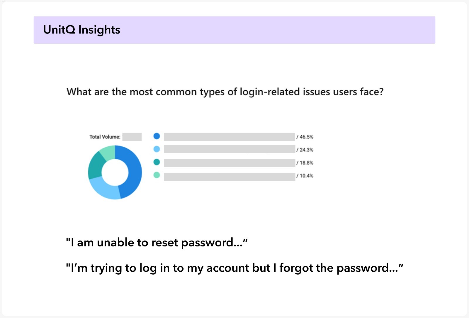
UnitQ: Key login question and real user quotes
Solution Part 1: Redesigning the Login Experience
To keep things organized, I created a shared workspace in Microsoft Loop where the whole team had access to research findings, work plans, and project progress.
The first step in the plan was to define clear business goals.
Our main goal was to reduce support load by improving the login experience across all sub-flows, aiming for a 30% drop in login-related support tickets.
After that, I created a research plan that included mapping all login-related flows, gathering user feedback, conducting a UX audit of the relevant screens, and exploring both competitive and technical benchmarks.
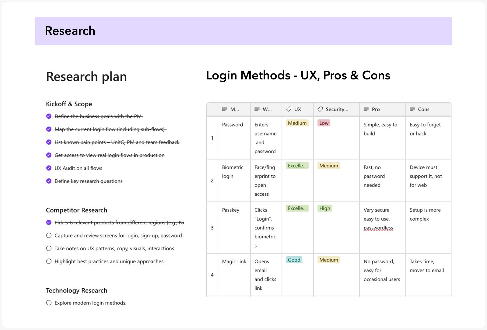
Research plan and insights on login methods

Competitor screenshots with sticky notes
Choosing the Right Layout
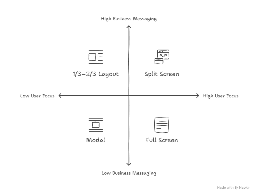
As part of the research, I also explored different UI layout options to improve clarity and usability.
I considered four layout types: full screen, split screen, 1/3–2/3, and modal.
I tested how the complex login content would fit and behave in each of these layouts.
Full screen felt clean and focused.
Since the login experience involved cross-functional stakeholders, I made sure to share the proposed changes and get input.
When I spoke with the Growth and Marketing teams, it became clear that we also needed space for business messaging.

Four design concepts for possible login layouts
Why We Chose the Split Screen Layout
With these insights, the split screen layout felt like the right choice.
But it also opened up new questions about the right content.
We started discussing what messages would be relevant, and we all knew we’d need to test them before making a final decision.
So we moved forward with the split-screen layout.
It kept the login flow clear and focused on one side, while providing space for business messaging on the other.
It was a good example of how collaboration led to a design that felt simple and effective for everyone involved.
Solution Part 2: Adding 2-Step Verification
SMS was the most common method, but it had a lot of downsides.
Users often had issues receiving the SMS messages, and it was costing the company millions each year.
We needed a better way to keep accounts safe.
So together with the PM, we started exploring other authentication methods.
We looked at what’s secure, easy to use, and compatible with our system.
We decided to offer two-step verification through third-party authenticator apps like Google or Microsoft Authenticator, while keeping SMS as a backup option.
Keeping It Simple and Clear
To support this decision, I researched how authenticator apps work, their pros and cons, and what this would mean for our users and support teams.
At every step, I focused on clarity for the user:
What do they see first? What should they do next? Is it clear and easy?
We explained the new verification process in the interface and notified users about the change through emails.
We wanted users to understand this change was meant to protect them, not make things harder.

Third-party authentication app – key challenges

Motivation for third-party authentication
Impact: Real Value for Users and Business
The new 2-step verification is expected to save millions of dollars each year by reducing reliance on SMS, and has already led to a significant drop in support calls.
The redesigned login pages follow the company's new design system, are easier to use, and most importantly, more secure.
Together with the analytics and support teams, we saw clear signs that the project was a success.
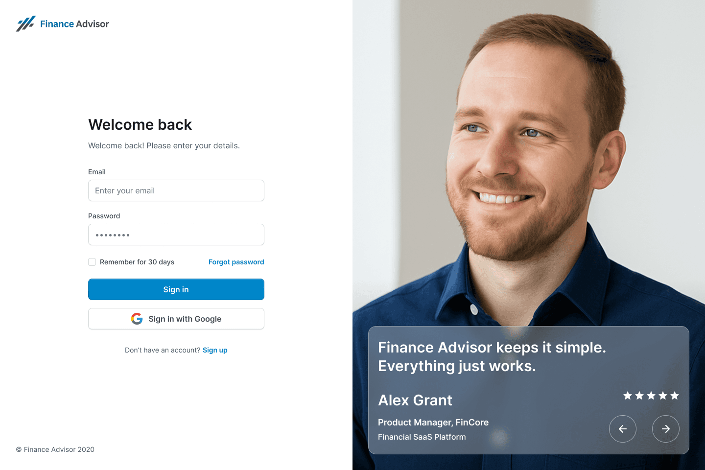
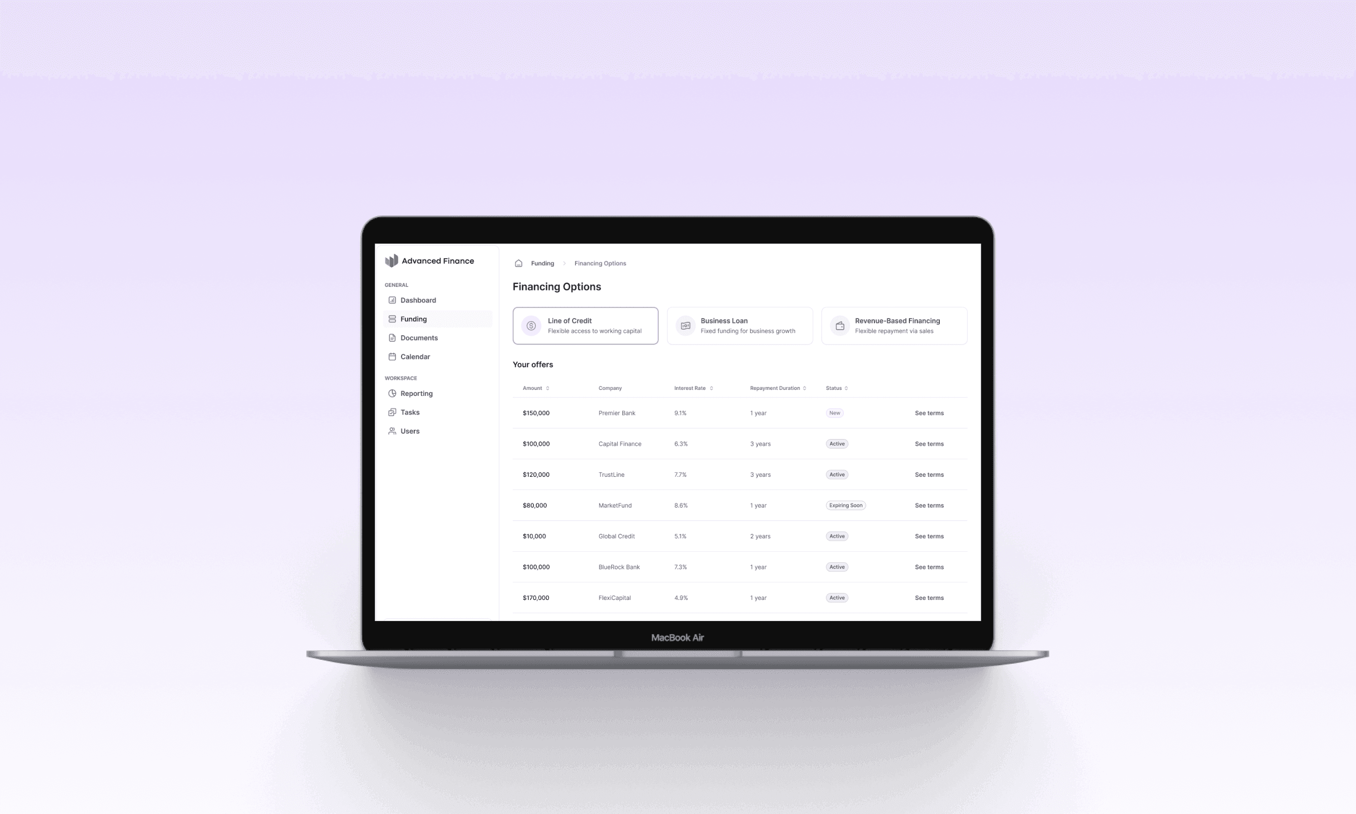
New login page design
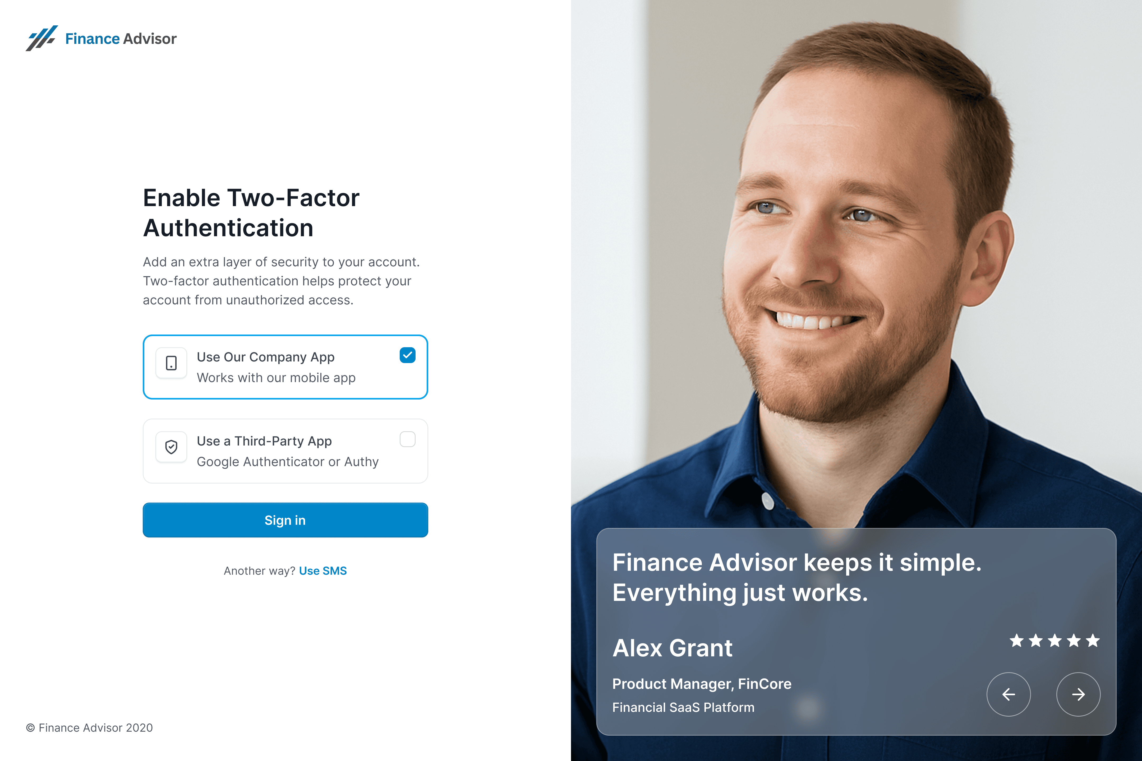
2FA with authenticator app – split layout
Key Takeaway
This project reminded me that good UX is more than screens and flows. It is about seeing the full picture, asking the right questions, and balancing user needs with business goals.
Sometimes a clean design is not enough, it must also support growth and trust. Listening to different teams helped me make smarter choices and build an experience that feels simple and safe for everyone.
Logging in is supposed to be simple. But for our users, it wasn’t.
Our login process was outdated and confusing. Two-step verification, our main security check, relied almost entirely on SMS codes which were expensive, often unreliable, and sometimes failed to arrive.
This hurt the user experience, increased frustration and support calls, and damaged users' trust in the system.
Storyboard: Failed login journey
Understanding the Real Problem
I began with user research to better understand the problem and make data-driven decisions.
I read support tickets on UnitQ and looked for answers to key questions like:
What are the most common types of login-related issues users face?
What are the most frequent error messages users receive during the login process?
What are the top reasons users contact support related to login or authentication problems?
I also spoke with analysts and PMs to spot patterns.
I found unclear error messages that left people stuck, flows that didn’t make sense, and a heavy reliance on SMS, which often failed right when users needed to log in. The login flow was far from easy or secure.
UnitQ: Key login question and real user quotes
Solution Part 1: Redesigning the Login Experience
To keep things organized, I created a shared workspace in Microsoft Loop where the whole team had access to research findings, work plans, and project progress.
The first step in the plan was to define clear business goals.
Our main goal was to reduce support load by improving the login experience across all sub-flows, aiming for a 30% drop in login-related support tickets.
After that, I created a research plan that included mapping all login-related flows, gathering user feedback, conducting a UX audit of the relevant screens, and exploring both competitive and technical benchmarks.
Research plan and insights on login methods
Competitor screenshots with sticky notes
Choosing the Right Layout
As part of the research, I also explored different UI layout options to improve clarity and usability.
I considered four layout types: full screen, split screen, 1/3–2/3, and modal.
I tested how the complex login content would fit and behave in each of these layouts.
Full screen felt clean and focused.
Since the login experience involved cross-functional stakeholders, I made sure to share the proposed changes and get input.
When I spoke with the Growth and Marketing teams, it became clear that we also needed space for business messaging.
Four design concepts for possible login layouts
Why We Chose the Split Screen Layout
With these insights, the split screen layout felt like the right choice.
But it also opened up new questions about the right content.
We started discussing what messages would be relevant, and we all knew we’d need to test them before making a final decision.
So we moved forward with the split-screen layout.
It kept the login flow clear and focused on one side, while providing space for business messaging on the other.
It was a good example of how collaboration led to a design that felt simple and effective for everyone involved.
Solution Part 2: Adding 2-Step Verification
SMS was the most common method, but it had a lot of downsides.
Users often had issues receiving the SMS messages, and it was costing the company millions each year.
We needed a better way to keep accounts safe.
So together with the PM, we started exploring other authentication methods.
We looked at what’s secure, easy to use, and compatible with our system.
We decided to offer two-step verification through third-party authenticator apps like Google or Microsoft Authenticator, while keeping SMS as a backup option.
Keeping It Simple and Clear
To support this decision, I researched how authenticator apps work, their pros and cons, and what this would mean for our users and support teams.
At every step, I focused on clarity for the user:
What do they see first? What should they do next? Is it clear and easy?
We explained the new verification process in the interface and notified users about the change through emails.
We wanted users to understand this change was meant to protect them, not make things harder.
Third-party authentication app – key challenges
Motivation for third-party authentication
Impact: Real Value for Users and Business
The new 2-step verification is expected to save millions of dollars each year by reducing reliance on SMS, and has already led to a significant drop in support calls.
The redesigned login pages follow the company's new design system, are easier to use, and most importantly, more secure.
Together with the analytics and support teams, we saw clear signs that the project was a success.
New login page design
2FA with authenticator app – split layout
Key Takeaway
This project reminded me that good UX is more than screens and flows. It is about seeing the full picture, asking the right questions, and balancing user needs with business goals.
Sometimes a clean design is not enough, it must also support growth and trust. Listening to different teams helped me make smarter choices and build an experience that feels simple and safe for everyone.
LATEST CASE STUDIES
LATEST CASE STUDIES
Case studies worth exploring
Case studies worth exploring
Read more case studies and see what worked and why.
Read more case studies and see what worked and why.