
Funding
Redesigning Funding Interfaces: What Real Testing Taught Us
We knew our customers needed better funding options. They wanted bigger amounts, fairer rates, and payment plans that actually worked for their businesses.
This wasn’t just a guess. We heard it directly from over 1,000 customers in a detailed survey. So we set out to redesign our funding area to make it clear, scalable, and flexible enough to serve different audiences around the world and support many types of funding offers.
Pre-redesign screen with few financing offers
Who Was I Designing For?
Our main users were SMB owners, especially those actively selling on online marketplaces. Some had taken funding from us before, others hadn’t.
During busy times like holidays, they really depended on flexible cash flow to buy inventory, jump on new opportunities, and grow. I wanted to make it easy for anyone to get the funding they needed.
Simplifying the Funding Experience
Redesigning the funding area required careful thinking and planning. We needed a new design that was scalable, supported different types of offers like loans and "Buy Now, Pay Later" options, and made it easy for users to explore their options and take the funding they need.
One of our main goals was to make complex financial terms easy to understand, so they wouldn’t hold users back.
Before we could simplify things for users, we had to make sure we understood them ourselves!
To do this, I led a focused workshop with the team. The process helped us
Review each offer type
Understand its value for customers
Decide what information needed to stand out in the design
This deep dive was a necessary step before moving into the next phase, applying a Design Thinking approach to solve the real problems.

Miro board for team alignment
Step 1: Empathize
For me, empathy means building a real connection with our users, but also with the business and the product. It means putting assumptions aside and exploring facts. I wanted to gather information that would help me make good design decisions later.
As part of this, I focused on:
Business: What are our business goals? How will we know we succeeded?
Users: Who are they? What do they need and why?
Product: Do our current interfaces meet UI/UX standards? Does it deliver real value to our users?
Step 2: Define
At this stage, I used insights from the research done during the Empathize phase to clearly define the problem we needed to solve for both our users and the business.
One big thing I noticed then was that our business goals weren't clear enough. They didn’t explain why we were doing it or how we would measure success.
To address this, I set up a meeting with our Director and Product Manager. This conversation was essential. It helped us uncover the real purpose behind the project and align on how to measure its success.
Once that was clear, I defined the updated goals and shared them with the entire team.
Step 3: Ideate
So, how could we actually show these new funding offers to our users?
I explored a few different design concepts:
A simple table listing all the options.
A calculator to help users see relevant offers.
A step-by-step guide (a wizard) that would walk them to the right offer.
Card-based layouts (horizontal and vertical).
I created rough paper sketches and simple wireframes, which we tested internally with the team. We also shared the work with stakeholders for alignment and feedback.


Early design concepts explored
Step 4: Prototype
We decided to go with the table design option. It might not have been the fanciest choice, but it was the most practical for our timelines and technically possible to build.
Once we made the decision, I built the prototype in Figma and set up a Maze test.
We shared it internally for review, made improvements based on feedback, and then moved on to testing with real users.
Step 5: Test
This was the moment of truth: did our solution actually work?
I ran several tests using Maze, with real customers in each round.
In one of them, I ran an A/B test comparing two versions:
Version A included an intro screen explaining the different offer types
Version B skipped the intro and took users straight to the offers
I wanted to see which version helped users better understand their funding type options.
The results were clear:
In version A, users got stuck. They spent almost a full minute on the intro page and answered our understanding questions incorrectly.
In version B, success rates jumped. People understood the offers faster and were able to choose the one that suited them with ease.
Based on these insights, I updated the design and removed the intro screen.
After that, we built and launched the final version.
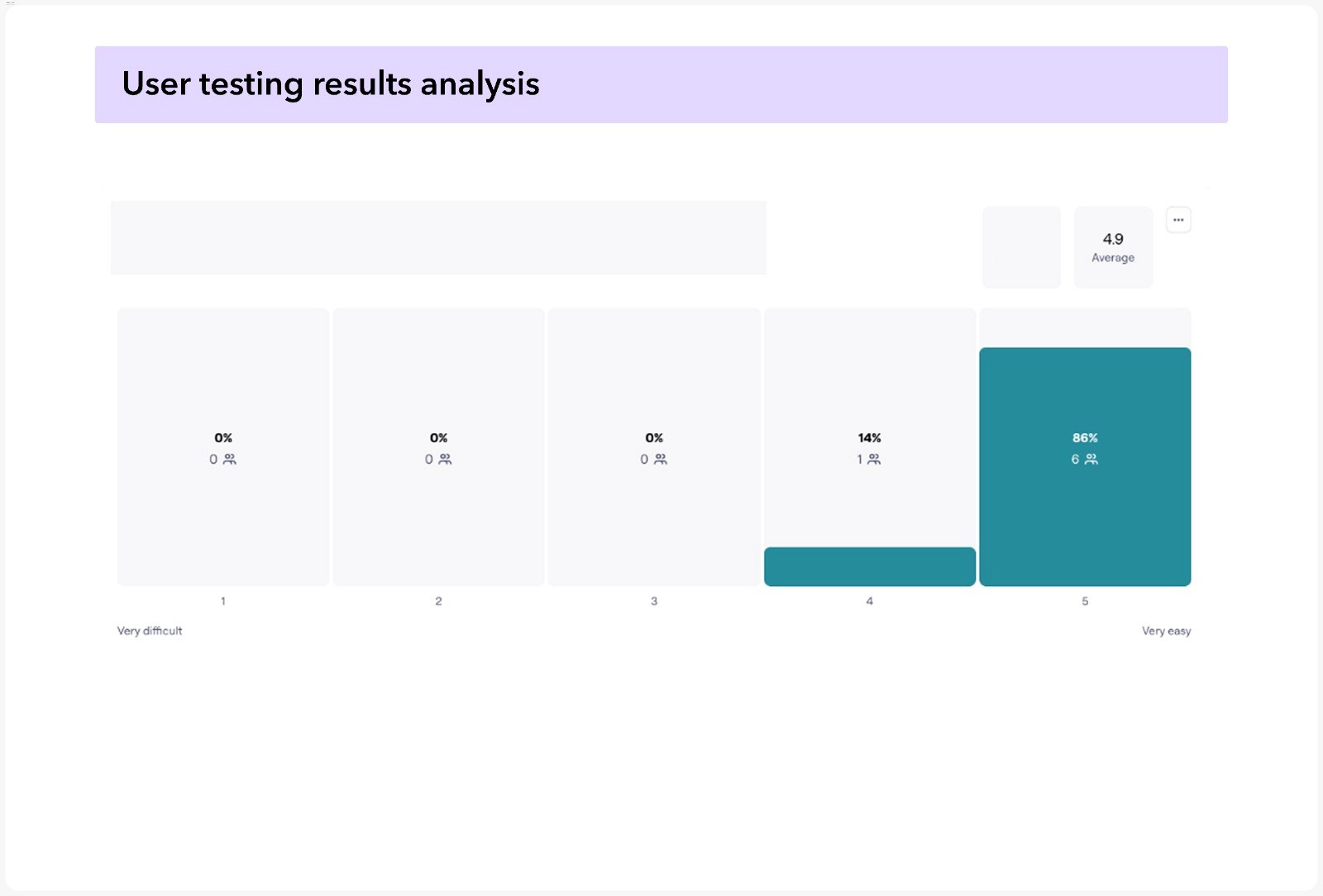
Maze test – choosing a funding offer

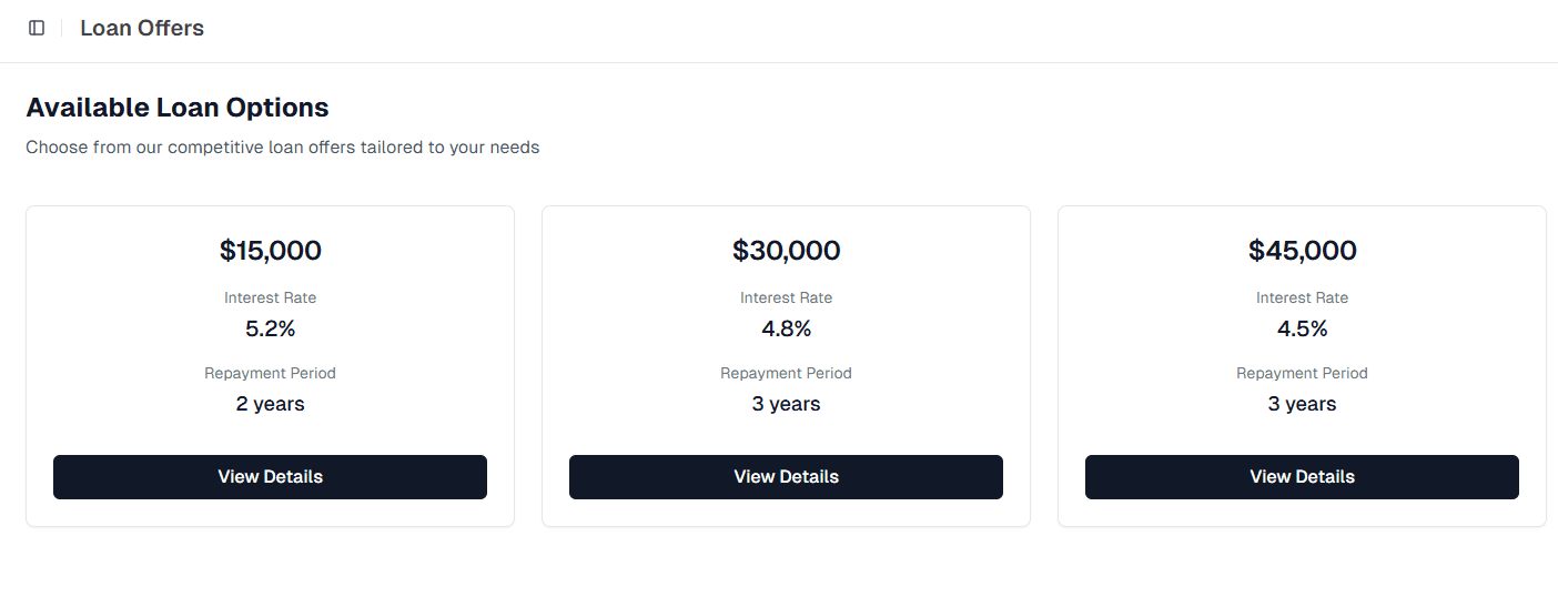
New offers interface – scalable and simple
The Big Result and What I Took Away
We launched a clear, well-tested solution that gave our customers the extra funding options they needed, while fully meeting our business goals.
Looking back, here’s what really stayed with me:
Simple is powerful. That extra screen I thought would help just got in the way.
Real users never lie. Testing with actual customers always shows you what truly works (and what doesn't).
I am not the user! My own assumptions can be wrong, and that's okay. The most important thing is to see what users actually need.
We knew our customers needed better funding options. They wanted bigger amounts, fairer rates, and payment plans that actually worked for their businesses.
This wasn’t just a guess. We heard it directly from over 1,000 customers in a detailed survey. So we set out to redesign our funding area to make it clear, scalable, and flexible enough to serve different audiences around the world and support many types of funding offers.
Pre-redesign screen with few financing offers
Who Was I Designing For?
Our main users were SMB owners, especially those actively selling on online marketplaces. Some had taken funding from us before, others hadn’t.
During busy times like holidays, they really depended on flexible cash flow to buy inventory, jump on new opportunities, and grow. I wanted to make it easy for anyone to get the funding they needed.
Simplifying the Funding Experience
Redesigning the funding area required careful thinking and planning. We needed a new design that was scalable, supported different types of offers like loans and "Buy Now, Pay Later" options, and made it easy for users to explore their options and take the funding they need.
One of our main goals was to make complex financial terms easy to understand, so they wouldn’t hold users back.
Before we could simplify things for users, we had to make sure we understood them ourselves!
To do this, I led a focused workshop with the team. The process helped us
Review each offer type
Understand its value for customers
Decide what information needed to stand out in the design
This deep dive was a necessary step before moving into the next phase, applying a Design Thinking approach to solve the real problems.
Miro board for team alignment
Step 1: Empathize
For me, empathy means building a real connection with our users, but also with the business and the product. It means putting assumptions aside and exploring facts. I wanted to gather information that would help me make good design decisions later.
As part of this, I focused on:
Business: What are our business goals? How will we know we succeeded?
Users: Who are they? What do they need and why?
Product: Do our current interfaces meet UI/UX standards? Does it deliver real value to our users?
Step 2: Define
At this stage, I used insights from the research done during the Empathize phase to clearly define the problem we needed to solve for both our users and the business.
One big thing I noticed then was that our business goals weren't clear enough. They didn’t explain why we were doing it or how we would measure success.
To address this, I set up a meeting with our Director and Product Manager. This conversation was essential. It helped us uncover the real purpose behind the project and align on how to measure its success.
Once that was clear, I defined the updated goals and shared them with the entire team.
Step 3: Ideate
So, how could we actually show these new funding offers to our users?
I explored a few different design concepts:
A simple table listing all the options.
A calculator to help users see relevant offers.
A step-by-step guide (a wizard) that would walk them to the right offer.
Card-based layouts (horizontal and vertical).
I created rough paper sketches and simple wireframes, which we tested internally with the team. We also shared the work with stakeholders for alignment and feedback.
Early design concepts explored
Step 4: Prototype
We decided to go with the table design option. It might not have been the fanciest choice, but it was the most practical for our timelines and technically possible to build.
Once we made the decision, I built the prototype in Figma and set up a Maze test.
We shared it internally for review, made improvements based on feedback, and then moved on to testing with real users.
Step 5: Test
This was the moment of truth: did our solution actually work?
I ran several tests using Maze, with real customers in each round.
In one of them, I ran an A/B test comparing two versions:
Version A included an intro screen explaining the different offer types
Version B skipped the intro and took users straight to the offers
I wanted to see which version helped users better understand their funding type options.
The results were clear:
In version A, users got stuck. They spent almost a full minute on the intro page and answered our understanding questions incorrectly.
In version B, success rates jumped. People understood the offers faster and were able to choose the one that suited them with ease.
Based on these insights, I updated the design and removed the intro screen.
After that, we built and launched the final version.
Maze test – choosing a funding offer
New offers interface – scalable and simple
The Big Result and What I Took Away
We launched a clear, well-tested solution that gave our customers the extra funding options they needed, while fully meeting our business goals.
Looking back, here’s what really stayed with me:
Simple is powerful. That extra screen I thought would help just got in the way.
Real users never lie. Testing with actual customers always shows you what truly works (and what doesn't).
I am not the user! My own assumptions can be wrong, and that's okay. The most important thing is to see what users actually need.
LATEST CASE STUDIES
LATEST CASE STUDIES
Case studies worth exploring
Case studies worth exploring
Read more case studies and see what worked and why.
Read more case studies and see what worked and why.

