Marketing
Improving clarity and feature adoption in an email marketing platform
After investing time and effort in crafting their email campaign, users like marketing managers, small business owners, content creators, and designers reached a critical step: the Review and Send screen, where they decide when, how, and to whom the email will be sent.
This final moment before launch should support users in completing the process smoothly and confidently. But instead, the interface created confusion. It was cluttered, unclear, and lacked a logical flow.
My goal was to redesign this screen, along with the entire flow of creating and sending an email campaign.
In this case study, I’ll walk you through the process that led to the new and improved Review and Send experience.
The Problem
The screen showed a long list of settings, all together, without structure or guidance. Users had to read everything line by line and figure out what really mattered.
I identified several core issues:
The order of fields did not match the natural user workflow
Too much content was shown at once, creating visual overload
Many users skipped advanced settings, often because they were labeled "optional"
Important features like AI-based send time suggestions were not visible or explained
The Goal
I wanted to redesign the Review and Send experience to make it feel clear, focused, and intuitive.
Instead of overwhelming users with too many choices at once, the new flow should guide them step by step, highlight key actions, and explain each option in a simple way.
It was also important to increase awareness and usage of advanced features, without adding friction.
At the same time, all existing functionality had to remain available and easy to complete.
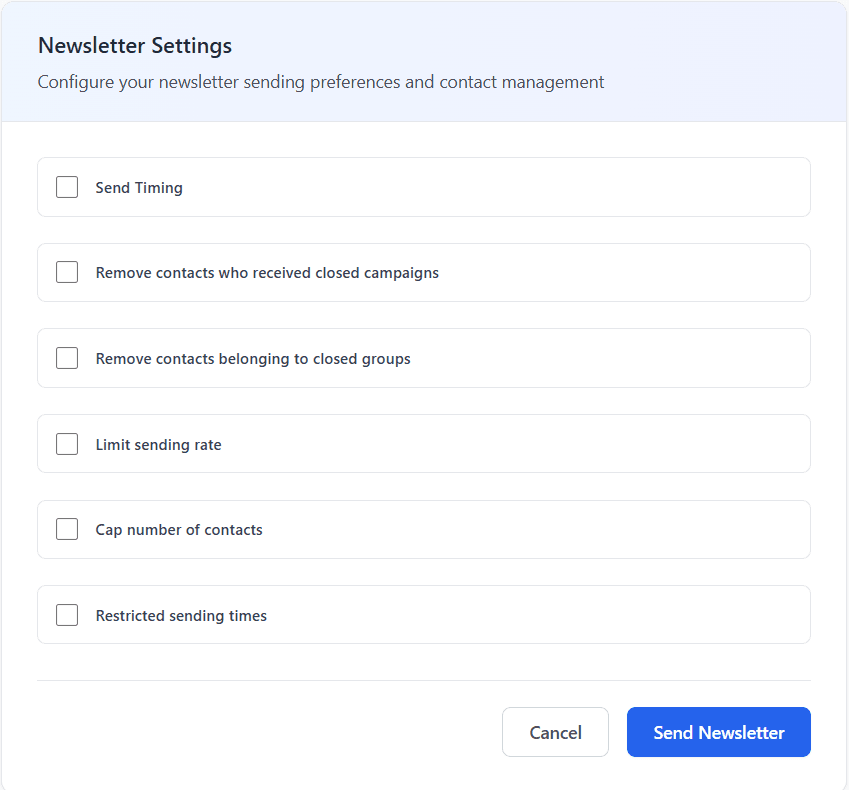
Original layout before the redesign
Research and Exploration
To better understand how to improve it, I explored different tools and reviewed the existing product. Here's what I did:
Explored and tested local and international email tools to experience how they structure the delivery flow.
Watched tool reviews and walkthroughs to understand the user perspective on usability.
Ran a UX audit of the full flow to check if the structure matched the user journey.
Collected feedback from the Product Manager about common customer complaints and requests

Design Decisions and Tradeoffs
At first, I considered changing the layout completely.
I wanted to display a large visual preview of the newsletter on one side, and a clear summary of key campaign details such as the name, audience, and estimated recipient count on the other.
But I realized that this would not solve the core issue, which was about clarity and structure in the delivery flow itself.
More than that, I wanted to find a solution that would require minimal development effort so we could move fast and deliver the improvement quickly.
So I decided to keep the existing layout and focus on reorganizing the content, simplifying the presentation, and guiding the user step by step.
What I Did
Improved information architecture
Moved certain settings earlier in the flow to match the natural user journey.
Campaign summary at the top
Added a brief summary to give users context and build confidence.
Clear primary actions
Introduced "Send now" and "Schedule for later" buttons for quick decision-making.
Helpful and simple copy
Rewrote labels and descriptions to make each option easier to understand.
Expandable sections
Used toggles to hide advanced settings until needed, reducing visual noise.
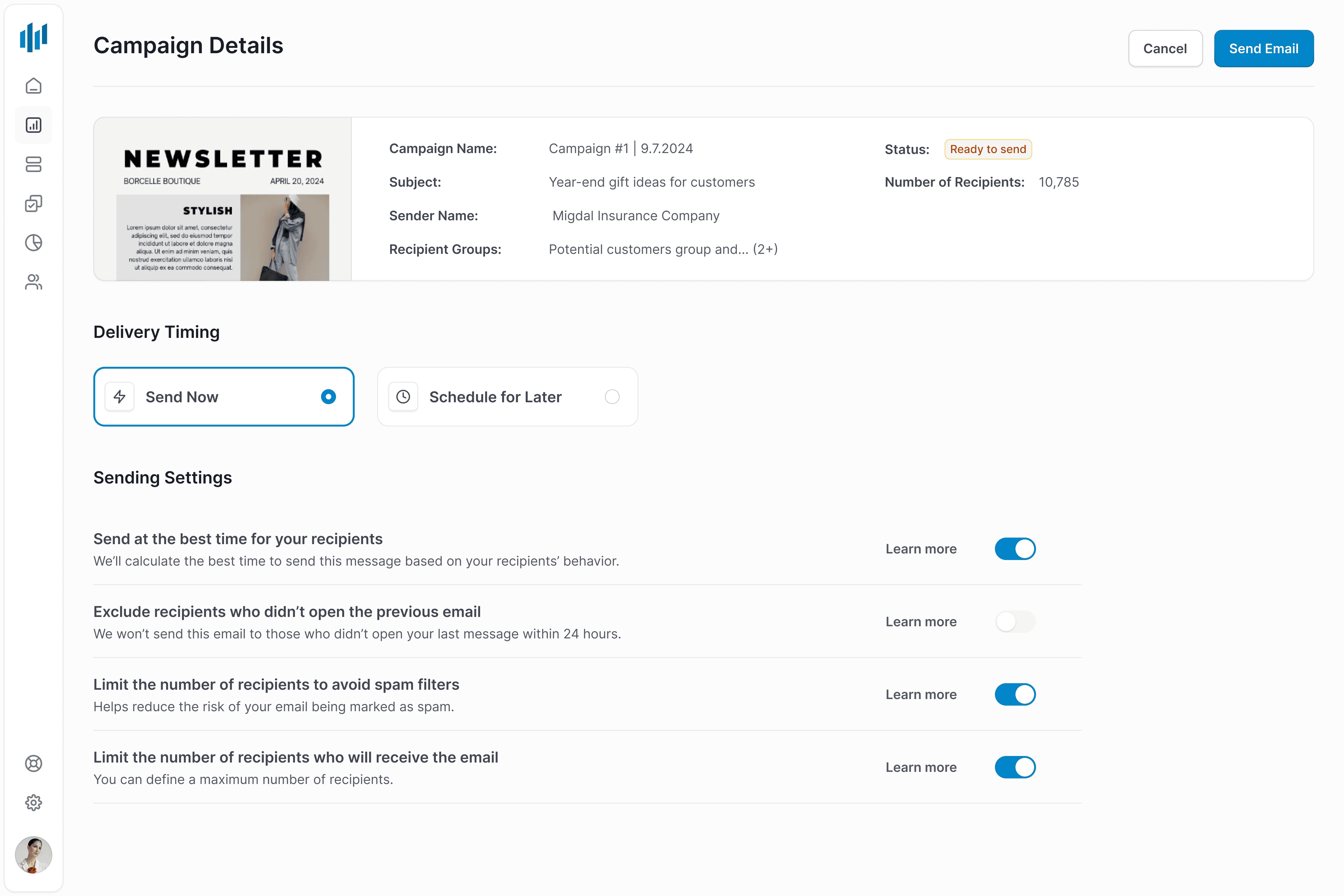
Redesigned Review and Send screen
The Outcome
Core features remained with a better experience
The design kept the main functionality while improving clarity and usability.
Users moved through the flow with more confidence
The new structure reduced confusion and helped users complete the process more smoothly.
Increased adoption of advanced features
More users discovered and used tools like the AI-based send time suggestion, directly supporting business goals.
No complaints after launch
The redesign went live with no support tickets or negative feedback.
After investing time and effort in crafting their email campaign, users like marketing managers, small business owners, content creators, and designers reached a critical step: the Review and Send screen, where they decide when, how, and to whom the email will be sent.
This final moment before launch should support users in completing the process smoothly and confidently. But instead, the interface created confusion. It was cluttered, unclear, and lacked a logical flow.
My goal was to redesign this screen, along with the entire flow of creating and sending an email campaign.
In this case study, I’ll walk you through the process that led to the new and improved Review and Send experience.
The Problem
The screen showed a long list of settings, all together, without structure or guidance. Users had to read everything line by line and figure out what really mattered.
I identified several core issues:
The order of fields did not match the natural user workflow
Too much content was shown at once, creating visual overload
Many users skipped advanced settings, often because they were labeled "optional"
Important features like AI-based send time suggestions were not visible or explained
The Goal
I wanted to redesign the Review and Send experience to make it feel clear, focused, and intuitive.
Instead of overwhelming users with too many choices at once, the new flow should guide them step by step, highlight key actions, and explain each option in a simple way.
It was also important to increase awareness and usage of advanced features, without adding friction.
At the same time, all existing functionality had to remain available and easy to complete.
Original layout before the redesign
Research and Exploration
To better understand how to improve it, I explored different tools and reviewed the existing product. Here's what I did:
Explored and tested local and international email tools to experience how they structure the delivery flow.
Watched tool reviews and walkthroughs to understand the user perspective on usability.
Ran a UX audit of the full flow to check if the structure matched the user journey.
Collected feedback from the Product Manager about common customer complaints and requests
Design Decisions and Tradeoffs
At first, I considered changing the layout completely.
I wanted to display a large visual preview of the newsletter on one side, and a clear summary of key campaign details such as the name, audience, and estimated recipient count on the other.
But I realized that this would not solve the core issue, which was about clarity and structure in the delivery flow itself.
More than that, I wanted to find a solution that would require minimal development effort so we could move fast and deliver the improvement quickly.
So I decided to keep the existing layout and focus on reorganizing the content, simplifying the presentation, and guiding the user step by step.
What I Did
Improved information architecture
Moved certain settings earlier in the flow to match the natural user journey.
Campaign summary at the top
Added a brief summary to give users context and build confidence.
Clear primary actions
Introduced "Send now" and "Schedule for later" buttons for quick decision-making.
Helpful and simple copy
Rewrote labels and descriptions to make each option easier to understand.
Expandable sections
Used toggles to hide advanced settings until needed, reducing visual noise.
Redesigned Review and Send screen
The Outcome
Core features remained with a better experience
The design kept the main functionality while improving clarity and usability.
Users moved through the flow with more confidence
The new structure reduced confusion and helped users complete the process more smoothly.
Increased adoption of advanced features
More users discovered and used tools like the AI-based send time suggestion, directly supporting business goals.
No complaints after launch
The redesign went live with no support tickets or negative feedback.
LATEST CASE STUDIES
LATEST CASE STUDIES
Case studies worth exploring
Case studies worth exploring
Read more case studies and see what worked and why.
Read more case studies and see what worked and why.